

UPMC Health Plan / Provider Directory
Provider Directory is UPMC’s online search tool for finding care providers and facilities. Recently, a medication search feature was added for prescription information. I lead UX research initiatives for this product, focusing on best practices and visual design for "promoted" cards to enhance visibility of nearby UPMC providers and improve search relevancy through exact matches and geospatial distance.
Through this research, we were looking to identify best practices for similar concepts, explore ideas of how to show hierarchy of providers that are equidistant, and present findings to key stakeholders.
MY ROLE
Lead researcher
Lead designer
Workshop facilitation
Competitive analyses
Executive reporting
METHODS
Moderated interviews
Stakeholder interviews
Design sprints
COLLABORATORS
Visual designers
Business partners
Product management
Design leadership
TIMELINE
1 month
Spoilers
After successful research and partnership with leadership, the new Provider Directory cards were launched in Q1 of 2021. This project included rapid research and design to accomplish the goal of promoted cards in less than a month!
We deferred some testing areas for future review but observed early, strong indications of a positive user experience when users searched for nearby healthcare options.
I. BACKGROUND
Field analysis

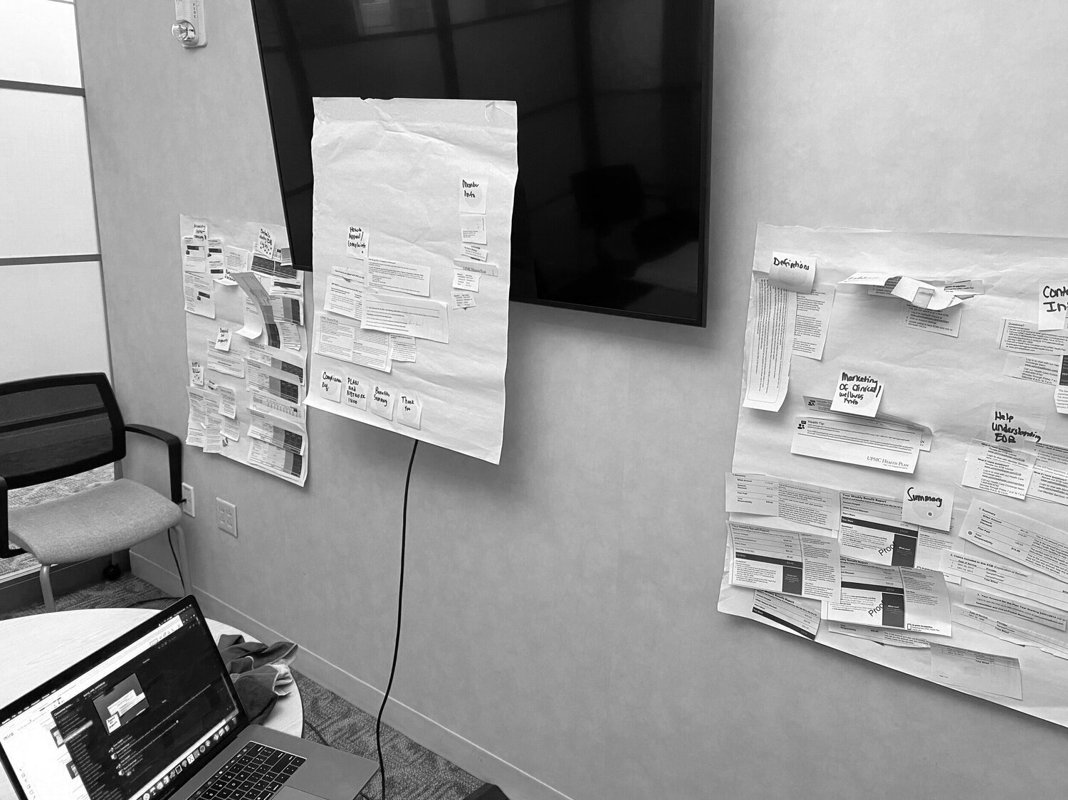
To begin this project, I researched best practices for promoted items, focusing on e-commerce platforms to understand search scoring and relevancy. I also examined how competitor health insurers used similar information architecture.
Concept design
After completing my research on product advertisement and promotion methodologies, our team used those insights to create concept designs. We had a clear understanding of the features for the "promoted" card, our objectives, metrics, design questions, and scenarios. Using this information, I created low-fidelity mockups, exploring various visual formats and UI arrangements based on a "flagging" concept to represent a visual indication of the card being promoted.


II. DESIGN PRESENTATION
High fidelity designs
Working on this project, my team focused on understanding the business requirements while empathizing with users searching for healthcare, based on existing research. After working together to create the low fidelity designs, we consolidated screens, presented them to stakeholders, and received overwhelmingly positive feedback to continue forward and prep the designs for testing.

We designed the promoted cards to resemble familiar e-commerce site promotions but tailored them for our healthcare context to benefit users. Key features included:
A dedicated section at the top of search results for the two nearest UPMC-owned providers
A title, "Your nearest UPMC providers," accompanying these top results
An angular “UPMC Provider” flag using our brand palette to highlight UPMC providers
A 3% opacity background on the top two promoted cards and within the UPMC provider flag for visual distinction
A divider separating the promoted section from default listings
Design characteristics

Our next objective in this initiative was to test these designs with our member audience to understand if this type of functionality would be useful, and also to validate our design decisions.
Metrics we were testing for in this study included:
Ease of identification on UPMC and non-UPMC providers
Ease of understand the ‘promoted listings’ section and how it relates to the entire page
Comprehension of map and geo-locations as they relate to the providers
Design, layout, and information architecture on the page
Pain points across the general provider search experience
Methodology included:
To move forward with testing, I lead the initiative and took to UserZoom, which is a research platform that the UX team uses to conduct usability studies across the board. Using this platform allows us to create and tailor studies to specific audiences / demographics, with affordance to construct tests to include both open-ended and task-based questions to validate any design decisions or objectives we set prior to testing.
This test was unmoderated, included 10 UPMC Health Plan members, and took about 35-45 minutes.
Key findings included:
All participants were able to identify the nearest UPMC provider on screen
All participants were able to identify the nearest non-UPMC provider on screen
All participants could identify the correspondence between geolocations of the map and provider cards
The overall experience of finding a UPMC provider was rated a 4.7/5
The overall likelihood of using this tool again was rated a 4.5/5
Testing
III. USER RESEARCH

Optimizing designs post-research
IV. ITERATION
Although we had a majority of positive feedback, we still felt it was important to tweak our designs to be optimal for our members. This meant using our data insights to further inform the visuals of the promoted cards before official launch.
Some of these final tweaks included:
Lessening the gap between filters and results
Further optimizing the understanding between results cards and map markers
Working designs into health facility pages
Consideration of content placement


V. DELIVERABLES
Completion of the project
The designs were officially launched in Q1 of 2021. This project included rapid research and design by myself and my teammates. We worked together to accomplish our goal of promoted provider cards in just over a month!
We backlogged a few other notes from testing for future iterations of this project as well. Since this project was completed, the designers continued supporting this product as well as other digital products at UPMC Health Plan.
VI. TESTIMONIALS
Quotes from teammates
“Candace and Sean really hit a home run with this work. Very thoughtful and creative solutioning”
“Amazing job - the work the UX team has done on this project has been invaluable to our product.”